Code
pacman::p_load(ggrepel, ggstatsplot, ggplot2, plotly, ggridges, ggdist, ungeviz, gganimate, performance, ggiraph, ggthemes, hrbrthemes, tidyverse, viridis, treemap, dplyr) City of Engagement, with a total population of 50,000, is a small city located at Country of Nowhere. The city serves as a service centre of an agriculture region surrounding the city. The main agriculture of the region is fruit farms and vineyards. The local council of the city is in the process of preparing the Local Plan 2023. A sample survey of 1000 representative residents had been conducted to collect data related to their household demographic and spending patterns, among other things. The city aims to use the data to assist with their major community revitalization efforts, including how to allocate a very large city renewal grant they have recently received. This study will provide user-friendly and interactive solution that helps city managers and planners to explore the complex data in an engaging way and reveal hidden patterns.
Two datasets are provided for this study:
This Dataset contains information about the residents of City of Engagement that have agreed to participate in this study.
participantId (integer): unique ID assigned to each participant.
householdSize (integer): the number of people in the participant’s household
haveKids (boolean): whether there are children living in the participant’s household.
age (integer): participant’s age in years at the start of the study.
educationLevel (string factor): the participant’s education level, one of: {“Low”, “HighSchoolOrCollege”, “Bachelors”, “Graduate”}
interestGroup (char): a char representing the participant’s stated primary interest group, one of {“A”, “B”, “C”, “D”, “E”, “F”, “G”, “H”, “I”, “J”}.
joviality (float): a value ranging from [0,1] indicating the participant’s overall happiness level at the start of the study.
This dataset contains information about financial transactions.
participantId (integer): unique ID corresponding to the participant affected
timestamp (datetime): the time when the check-in was logged
category (string factor): a string describing the expense category, one of {“Education”, “Food”, “Recreation”, “RentAdjustment”, “Shelter”, “Wage”}
amount (double): the amount of the transaction
The code chunk below is used to install and load the required packages onto RStudio.
tidyverse: a family of modern R packages specially designed to support data science, analysis and communication task including creating static statistical graphs.
dplyr: a package in R that provides a set of functions for data manipulation, transformation, and summarization
ggplot2: a system for creating graphics, based on The Grammar of Graphics
ggstatplot: an extension of ggplot2 package for creating graphics with details from statistical tests included in the plots themselves and targeted primarily at behavioral sciences community to provide a one-line code to produce information-rich plots.
ggrepel: a package provides geoms for ggplot2 to repel overlapping text labels.
ggiraph: a package that provides interactive elements to ggplot like animations and tooltips (was not used after experimenting with it, leaving it here for reference).
ggridges: a package for creating ridge plots, which are a type of data visualization that displays the distribution of a continuous variable for different categories.
ggthemes: a package provides some extra themes, geoms, and scales for ‘ggplot2’.
gganimate: a package that allows for the creation of animated visualizations using ggplot2. It provides a framework for creating animated plots from a static ggplot object by mapping aesthetic attributes to time.
ggdist: a package that provides functions for generating simulated data from common distributions and for calculating and visualizing various summary statistics, such as posterior distributions from Bayesian models.
hrbrthemes: a package provides typography-centric themes and theme components for ggplot2.
plotly: another package that provides interactive elements to ggplot.
ungeviz: apackage that provides a collection of interactive visualizations for exploratory data analysis.
treemap: a package provides an easy way to create treemaps, which are visualizations that display hierarchical data as a set of nested rectangles
pacman::p_load(ggrepel, ggstatsplot, ggplot2, plotly, ggridges, ggdist, ungeviz, gganimate, performance, ggiraph, ggthemes, hrbrthemes, tidyverse, viridis, treemap, dplyr) The 2 datasets are imported into R environment.
part <- read_csv("data/Participants.csv")fj <- read_csv("data/FinancialJournal.csv")First, conversion of “timestamp” column to “Month-Year” format in chr form is carried out.
fj$Month_Yr <- format(as.Date(fj$timestamp), "%Y-%m")A check for duplicate rows in the dataset is conducted. By running the code chunk below, it is found that there are 1113 duplicate rows. These duplicate rows are subsequently removed from the analysis.
# Check for full duplicate rows
duplicated_rows <- fj[duplicated(fj, fromLast = TRUE),]

# Remove the duplicate rows (if any)
if (nrow(duplicated_rows) > 0) {
  print("Full duplicate rows found and removed:")
  fj1 <- subset(fj, !duplicated(fj, fromLast = TRUE))
} else {
  print("No full duplicate rows found.")
}
[1] "Full duplicate rows found and removed:"The dataset is pivoted to display the different categories of costs as separate columns.
library(dplyr)
library(tidyr)

# Group by two columns (e.g., "category" and "year") and summarize the values in another column (e.g., "value")
fj1_grouped <- fj1 %>%
  group_by(participantId, Month_Yr, category) %>%
  summarize(total_amount = sum(amount))

# Pivot the data from rows to columns
fj1_pivoted <- fj1_grouped %>%
  pivot_wider(names_from = category, values_from = total_amount)
All “NA” values are replaced with “0” in all columns. A new column is created to compute new rent amount, taking into consideration of the rent adjustment.
# Replace "NA" values in column with "0"
#fj1_pivoted$RentAdjustment <- ifelse(is.na(fj1_pivoted$RentAdjustment), 0, fj1_pivoted$RentAdjustment)
fj1_pivoted[is.na(fj1_pivoted)] <- 0.0

# Add the values in column A to column B and store in a new column C
fj1_pivoted$Shelter_rev <- fj1_pivoted$Shelter + fj1_pivoted$RentAdjustment
Under the expenditure columns, there are negative integers that indicates outlay of costs. All these values are adjusted to positive integers and rounded 2 decimal points, for clarity and consistency.
# Convert the values in a column to positive integers, rounded to 2 decimal points
fj1_pivoted$Education <- round(abs(fj1_pivoted$Education), 2)
fj1_pivoted$Food <- round(abs(fj1_pivoted$Food), 2)
fj1_pivoted$Recreation <- round(abs(fj1_pivoted$Recreation), 2)
fj1_pivoted$Shelter <- round(abs(fj1_pivoted$Shelter), 2)
fj1_pivoted$Wage <- round(abs(fj1_pivoted$Wage), 2)
fj1_pivoted$RentAdjustment <- round(abs(fj1_pivoted$RentAdjustment), 2)
fj1_pivoted$Shelter_rev <- round(abs(fj1_pivoted$Shelter_rev), 2)
Lastly, new columns for total income and total expenditures are created in the dataset to facilitate the subsequent analysis.
fj1_pivoted$Total_income <- fj1_pivoted$Wage

# creating new columns
fj1_pivoted$Total_expenditure <- fj1_pivoted$Education + fj1_pivoted$Food + fj1_pivoted$Recreation + fj1_pivoted$Shelter_revThe dataset contains 1011 (instead of 1000 as informed) representative participants. Check for duplicate rows in the dataset is carried out and there are no duplicates found in the data.
# Check for full duplicate rows
duplicated_rows <- part[duplicated(part, fromLast = TRUE),]

# View the duplicate rows (if any)
if (nrow(duplicated_rows) > 0) {
  print("Full duplicate rows found:")
  print(subset(part, duplicated(part, fromLast = TRUE)))
} else {
  print("No full duplicate rows found.")
}
[1] "No full duplicate rows found."In addition, the following data preparation is carried out: (i) Recode “Bachelors” to be same as “Graduate” under “educationLevel” column for clarity and consistency, as both refers to the same category, (ii) Round values under “Joviality” column to 2 decimal points and (iii) Amend both “participantId” and “householdSize” columns to chr format.
part$educationLevel <- ifelse(part$educationLevel == "Bachelors", "Graduate", part$educationLevel)

part$joviality <- round(part$joviality, 2)

part$participantId <- as.character(part$participantId)

part$householdSize <- as.character(part$householdSize)Both dataset (on participants and financial information) are merged into a single base dataset, for the subsequent analysis.
# Merge two data frames using a common column
merged_df <- merge(part, fj1_pivoted, by = "participantId")

glimpse(merged_df)
Rows: 10,691
Columns: 17
$ participantId <chr> "0", "0", "0", "0", "0", "0", "0", "0", "0", "0", "0…
$ householdSize <chr> "3", "3", "3", "3", "3", "3", "3", "3", "3", "3", "3…
$ haveKids <lgl> TRUE, TRUE, TRUE, TRUE, TRUE, TRUE, TRUE, TRUE, TRUE…
$ age <dbl> 36, 36, 36, 36, 36, 36, 36, 36, 36, 36, 36, 36, 25, …
$ educationLevel <chr> "HighSchoolOrCollege", "HighSchoolOrCollege", "HighS…
$ interestGroup <chr> "H", "H", "H", "H", "H", "H", "H", "H", "H", "H", "H…
$ joviality <dbl> 0.00, 0.00, 0.00, 0.00, 0.00, 0.00, 0.00, 0.00, 0.00…
$ Month_Yr <chr> "2022-03", "2022-04", "2022-05", "2022-06", "2022-07…
$ Education <dbl> 38.01, 38.01, 38.01, 38.01, 38.01, 38.01, 38.01, 38.…
$ Food <dbl> 268.34, 265.86, 264.62, 256.97, 270.21, 261.84, 256.…
$ Recreation <dbl> 348.72, 219.43, 383.01, 465.68, 1069.54, 314.14, 294…
$ Shelter <dbl> 554.99, 554.99, 554.99, 554.99, 554.99, 554.99, 554.…
$ Wage <dbl> 11931.95, 8636.88, 9048.16, 9048.16, 8636.88, 9459.4…
$ RentAdjustment <dbl> 0, 0, 0, 0, 0, 0, 0, 0, 0, 0, 0, 0, 0, 0, 0, 0, 0, 0…
$ Shelter_rev <dbl> 554.99, 554.99, 554.99, 554.99, 554.99, 554.99, 554.…
$ Total_income <dbl> 11931.95, 8636.88, 9048.16, 9048.16, 8636.88, 9459.4…
$ Total_expenditure <dbl> 1210.06, 1078.29, 1240.63, 1315.65, 1932.75, 1168.98…To have an overview on the financial behaviour of the residents, one-sample mean test on the total expenditure for all 1011 representative participants is carried out based on 95% confidence interval.
The output shows that the distribution is relatively uniformly distributed. It is observed that the average total expenditure of the population is 18,087 dollars. This almost coincides with the peak value at about 17,500 dollars of nearly 80 counts. It is noted that there were 131 participants with total expenditure less than 1000 dollars. They are treated as outliers and are excluded for the analysis.
merged_df1 <- merged_df

library(dplyr)

#Group by one column and summarize the other columns by summing up the values within each group
 Income_Exp_summary <- merged_df %>%
   group_by(`participantId`) %>%
   summarize(`Food` = sum(`Food`),
             `Recreation` = sum(`Recreation`),
             `Shelter_rev` = sum(`Shelter_rev`),
             `Total_income` = sum(`Total_income`),
`Total_expenditure` = sum(`Total_expenditure`))set.seed(1234)
gghistostats(
data = Income_Exp_summary,
x = 'Total_expenditure',
type = "bayes",
test.value = 15000,
xlab = "amount in dollars" ) +
ggtitle("Total expenses distribution for all categories")Income_Exp_summary <- Income_Exp_summary %>%
filter(`Total_expenditure` >= 1000)
set.seed(1234)

gghistostats(
  data = Income_Exp_summary,
  x = 'Total_expenditure',
  type = "bayes",
  test.value = 15000,
  xlab = "amount in dollars" ) +
  ggtitle("Total expenses distribution for all categories")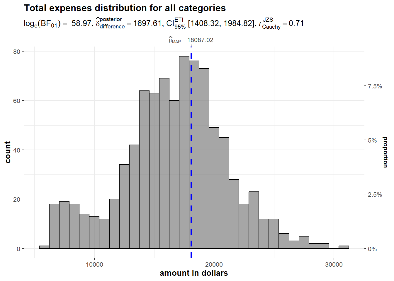
We also investigate the distribution of the total income amount using histogram. Based on the output generated, it is observed that the distribution is heavily right skewed as majority of data is concentrated on the left-hand side of the distribution, with the tail of the distribution extending to the right. The average total expenditure of the population is 31,339 dollars.
set.seed(1234)

gghistostats(
  data = Income_Exp_summary,
  x = 'Total_income',
  type = "bayes",
  test.value = 1500,
  xlab = "amount in dollars" ) +
  ggtitle("Income distribution")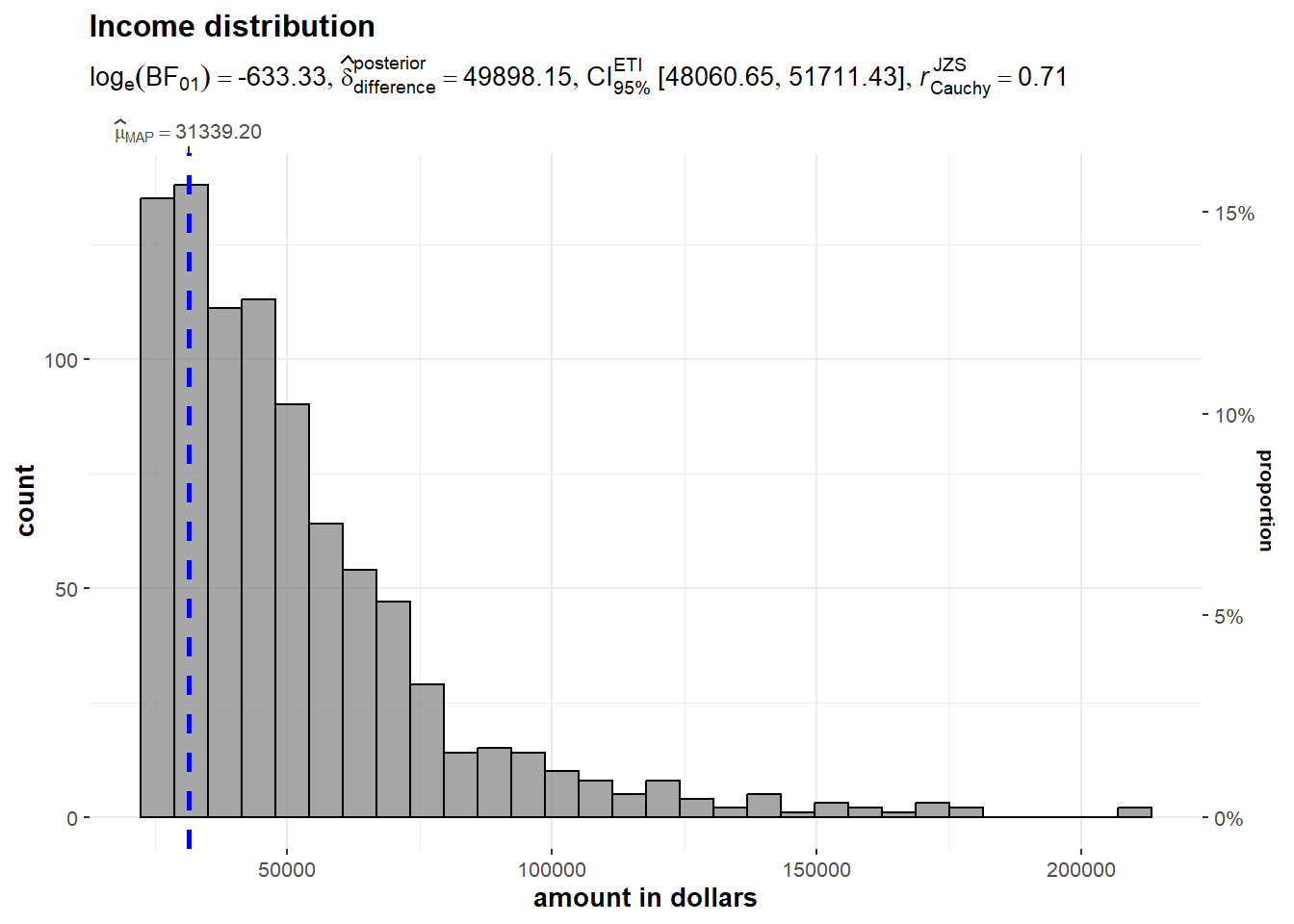
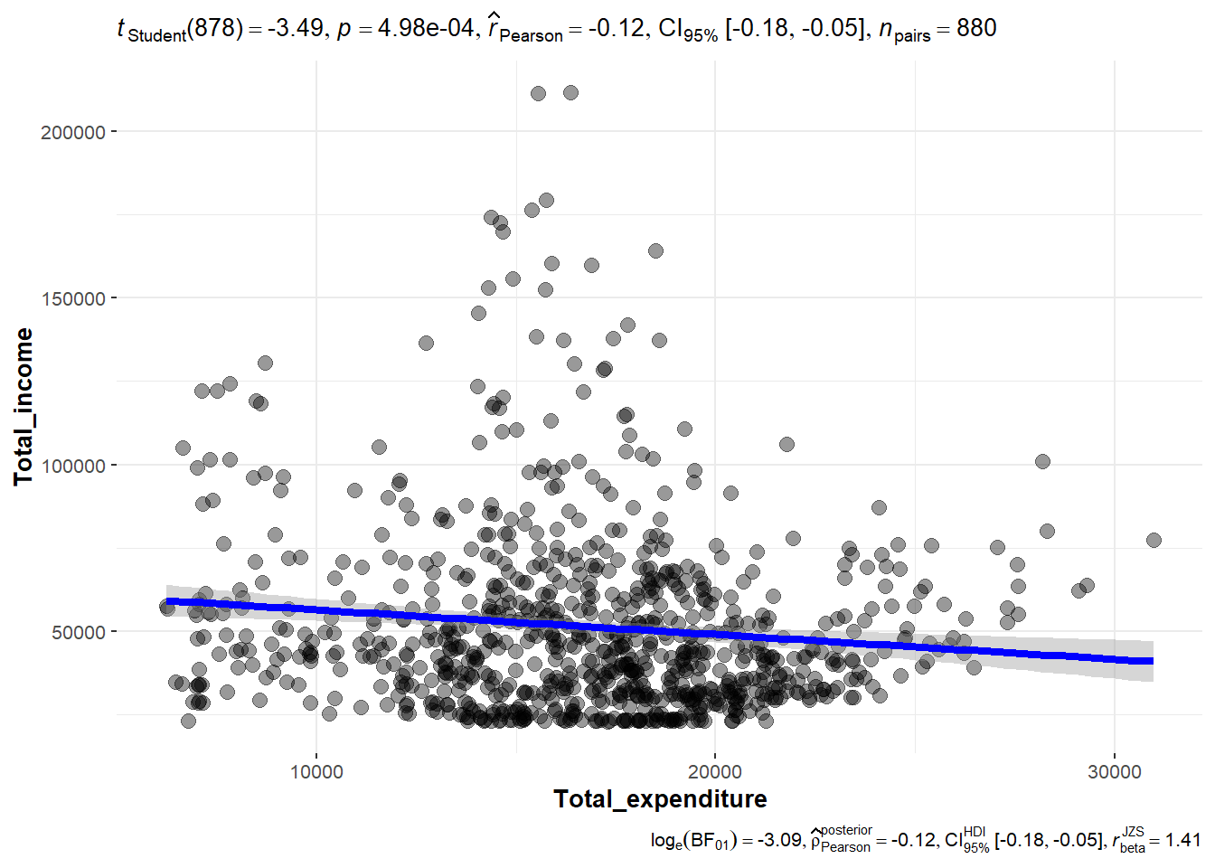
Here, we would like to explore the relationship between total income vs total expenditure of the population. We test the following hypothesis using significant Test of Correlation with ggscatterstats method.
From the output of Student t test, the p value is < 0.05. Thus we reject the hypothesis and conclude that there is no correlation between total income and total expenditure at 95% confidence interval. The Pearson’s correlation coefficient (r), which is a measure of the linear association between two variables, is -0.11 and that also indicates non-correlation between the two variables tested.
ggscatterstats(
  data = Income_Exp_summary,
  x = Total_expenditure,
  y = Total_income,
  marginal = FALSE
  )
For this analysis, we examine the total expenditure distribution across the twelve months. The mean total expenditure is highest in March 2022 at approximated amount of 1,700 dollars. We can infer this as a bonus payment for the working population possibility due to successful agriculture harvest based on assumption that the City’s population are largely employed in this industry (given that the city serves as a service centre of an agriculture region surrounding it).
merged_df %>%
  ggplot(aes(x = Month_Yr,
             y = Total_expenditure)) +
  stat_gradientinterval(
    fill = "pink",
    show.legend = TRUE
  ) +
  coord_cartesian(ylim = c(0, 3500)
  ) + #<<
  labs(
    title = "Visualising confidence intervals of mean total expenditure amount",
    subtitle = "Mean Point + Multiple-interval plot")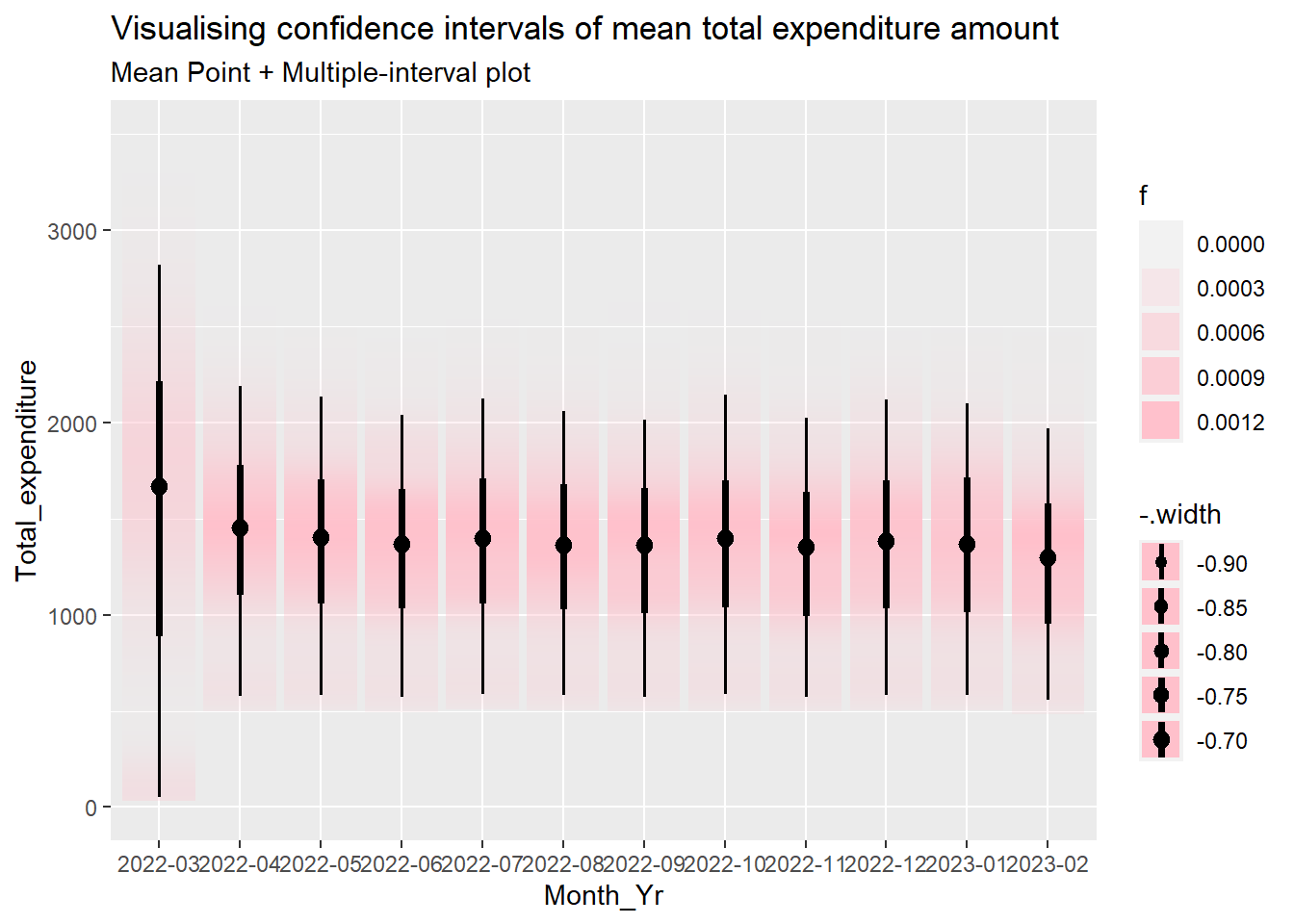
The data can be visualised with Hypothetical Outcome Plots (HOPs).
ggplot(data = merged_df,
       (aes(x = factor(Month_Yr), y = Total_expenditure))) +
  geom_point(position = position_jitter(
    height = 0.3, width = 0.05),
    size = 0.4, color = "#0072B2", alpha = 1/2) +
  geom_hpline(data = sampler(25, group = Month_Yr), height = 0.6, color = "#D55E00") +
  theme_bw() +
  # `.draw` is a generated column indicating the sample draw
  transition_states(.draw, 1, 3)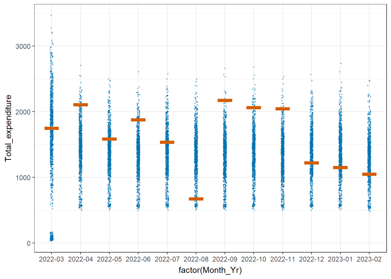
We create multi-ridge plots to determine the total expenditure distribution across different participant age groups to have an idea on how different they could be. The 2 highest age groups register more movements in terms of the ridge shape over the twelve months period while the 21 - 30 age group is relatively stable. It is also observed that the 11-20 age group has more fluctuations from end 2022 onwards.
#binning age values

merged_df_bin <- merged_df

merged_df_bin$age <- cut(merged_df_bin$age, breaks = c(0, 10, 20, 30, 40, 50, 60),
                       labels = c("0-10", "11-20", "21-30", "31-40", "41-50", "51-60"))

merged_df_bin$YearMthDay <- as.Date(paste0(merged_df_bin$Month_Yr,"-01"))

ggplot(data = merged_df_bin, aes(x = Total_expenditure, y = age, fill = after_stat(x))) +

  geom_density_ridges_gradient(scale = 3, rel_min_height = 0.01) +

  theme_minimal() +

    labs(title = 'Total Expenditure by Age: {frame_time}',
       y = "Age",
       x = "Total Expenditure amount") +

  theme(legend.position="none",
  text = element_text(family = "Garamond"),
  plot.title = element_text(face = "bold", size = 12),

  axis.title.x = element_text(size = 10, hjust = 1),
  axis.title.y = element_text(size = 10),
  axis.text = element_text(size = 8)) +

  scale_fill_viridis(name = "Total_expenditure", option = "H") +

  transition_time(merged_df_bin$YearMthDay) +
  ease_aes('linear')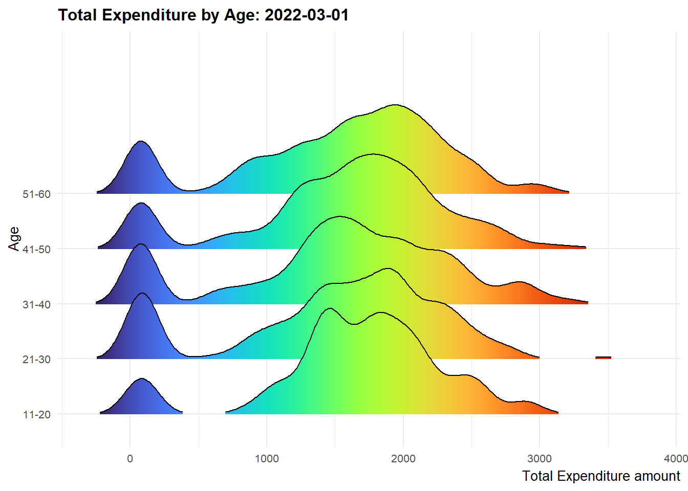
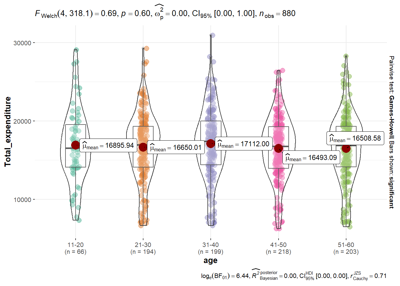
To obtain deeper insights on the findings, We would like to determine if there are significant differences of total expenditure between age groups, by performing ANOVA test using ggbetweenstats function for non-parametric test. We assume unknown and unequal variance in this case.
Ho: the mean total expenditure amount is the same for all ages
H1: the mean total expenditure amount is different for all ages
Based on the output of the Welch’s test, p > 0.05 and therefore we cannot conclude that there is significant difference exists in the mean total expenditure amount for all age groups.
# Merge the two data frames using a common column
part_innc_exp_summary <- merge(part, Income_Exp_summary, by = "participantId")

#binning age values
part_innc_exp_summary$age <- cut(part_innc_exp_summary$age, breaks = c(0, 10, 20, 30, 40, 50, 60),
                       labels = c("0-10", "11-20", "21-30", "31-40", "41-50", "51-60"))

ggbetweenstats(
  data = part_innc_exp_summary,
  x = age,
  y = Total_expenditure,
  type = "p",
  mean.ci = TRUE,
  pairwise.comparisons = TRUE,
  pairwise.display = "s",
  p.adjust.method = "fdr",
  messages = FALSE
)
To determine whether the population is in good financial health, we will develop a metric based on percentage of savings over income to determine its financial health status.
The columns are plotted based on various age groups and the highest mean percentage of savings based on 90% confidence interval is found to be 60.7% belonging to the age group from 21 to 30 years old. The lowest mean percentage of savings is 58.7% in the 41 to 50 years old group. We can infer that one of the reasons could be that residents at this age generally have relatively more demanding cost commitments as compared with other age groups. Overall, with the lowest mean percentage saving already more than 50%, we can conclude that the overall financial health of the population is positive.
#create a new data frame
fin_health <- part_innc_exp_summary

#compute percntage of savings and percentage of expenses as new columns
fin_health$Pct_savings <- (fin_health$Total_income - fin_health$Total_expenditure) * 100 / fin_health$Total_income
fin_health$Pct_expenses <- (fin_health$Total_expenditure) * 100 / fin_health$Total_incometooltip <- function(y, ymax, accuracy = .01) {
mean <- scales::number(y, accuracy = accuracy)
sem <- scales::number(ymax - y, accuracy = accuracy)
paste("Mean Percenage of Total Savings:", mean, "+/-", sem)
}
gg_point <- ggplot(data=fin_health,
aes(x = age),
) +
stat_summary(aes(y = Pct_savings,
tooltip = after_stat(
tooltip(y, ymax))),
fun.data = "mean_se",
geom = GeomInteractiveCol,
#fill = "orange"
) +
stat_summary(aes(y = Pct_savings),
fun.data = mean_se,
geom = "errorbar", width = 0.2, size = 0.2
)
girafe(ggobj = gg_point,
width_svg = 8,
height_svg = 8*0.618)An animated bubble plot is created to show the trend of the percentage of total expenses vs total income for the sample participants over the period of twelve months to understand their spending trend using plotly method. It is not unexpected that participants of lower income group have higher percentage of expenses. It is also observed that there were some participants who overspent (percentage of expenses >100%).
 # Create new dataframe
 merged_df_fin_health <- merged_df

 merged_df_fin_health$Pct_savings <- (merged_df_fin_health$Total_income - merged_df_fin_health$Total_expenditure) * 100 / merged_df_fin_health$Total_income

 merged_df_fin_health$Pct_expenses <- (merged_df_fin_health$Total_expenditure) * 100 / merged_df_fin_health$Total_income


 bp <- merged_df_fin_health %>%
   plot_ly(x = ~Total_income,
           y = ~Pct_expenses,
           size = ~age,
           color = ~age,
           sizes = c(2, 30),
           frame = ~Month_Yr,
           text = ~participantId,
           hoverinfo = "text",
           type = 'scatter',
           mode = 'markers'
           ) %>%
   layout(showlegend = FALSE)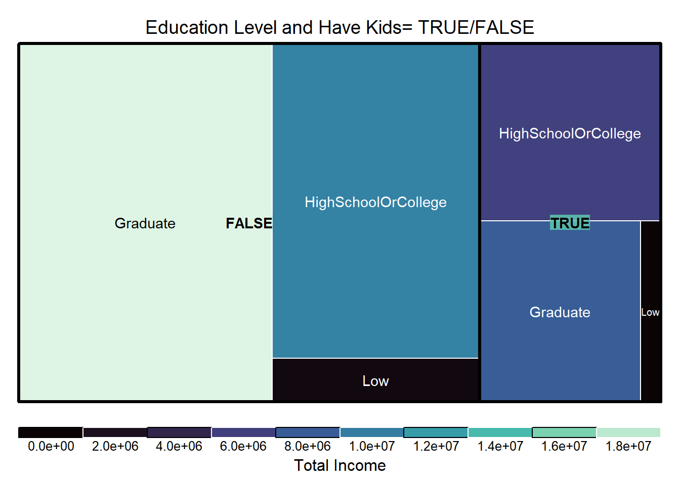
bpUsing the Tree map, we can develop further understanding on the population demography and relative percentage of wages they save by comparing the size of boxes in the plot. Key insights that can be drawn are (i) For residents without kids, the graduates group is the highest in terms of percentage of income saved, and (ii) Residents of low educational qualification has the least percentage of income saved regardless of having kids.
library(treemap)

treemap_area <- treemap (merged_df_fin_health,
        index= c("haveKids", "educationLevel"),
        vSize= "Pct_savings",
        vColor = "Total_income",
        type="manual",
        palette = mako(8),
        border.col = c("black", "white"),
        title="Education Level and Have Kids= TRUE/FALSE",
        title.legend = "Total Income"
        )
https://www.rdocumentation.org/packages/base/versions/3.6.2/topics/as.Date
https://www.rapidtables.com/math/symbols/Statistical_Symbols.html
https://www.scribbr.com/statistics/t-test/
https://towardsdatascience.com/parametric-tests-the-t-test-c9b17faabfb0
https://stats.stackexchange.com/questions/341553/what-is-bayesian-posterior-probability-and-how-is-it-different-to-just-using-a-p
http://www.cookbook-r.com/Graphs/Colors_(ggplot2)/