Code
pacman::p_load(jsonlite, igraph, tidygraph, ggraph,
               visNetwork, lubridate, clock,
               tidyverse, graphlayouts)
The country of Oceanus has sought FishEye International’s help in identifying companies possibly engaged in illegal, unreported, and unregulated (IUU) fishing. FishEye’s analysts had received import/export data for Oceanus’ marine and fishing industries, but the data is incomplete. FishEye had subsequently transformed the trade data into a knowledge graph to help them understand the business relationships, including finding links that will stop IUU fishing and protect marine species.
We will address Question 1 of VAST challenge 2023 - To Use visual analytics to identify temporal patterns and categorise types of business relationship for individual entities and between entities in FishEye’s knowledge graph.
To select and use different attributes to identify the interactions and relationship among companies and their attributes.
The code chunk below will be used to install and load the necessary R packages as follows:
jsonlite: a package supports both reading and writing JSON files, as well as working with JSON data retrieved from web APIs.
igraph: a package in R that offers a wide range of tools for creating, manipulating, and visualizing graphs, as well as various algorithms and metrics for network analysis.
tidygraph: provides a tidy and consistent approach to working with graph data using the principles of the tidyverse
ggraph: an extension package in R that builds upon the tidygraph and ggplot2 packages. It provides a high-level interface for creating visualizations of graph data using the grammar of graphics approach.
viznetwork: a package provides geoms for ggplot2 to repel overlapping text labels.
lubridate: a package in R that provides functions for working with dates and times. It aims to simplify common tasks related to date and time manipulation and offers a consistent and intuitive interface.
tidyverse: a family of modern R packages specially designed to support data science, analysis and communication task including creating static statistical graphs.
pacman::p_load(jsonlite, igraph, tidygraph, ggraph,
visNetwork, lubridate, clock,
tidyverse, graphlayouts)The function fromJSON() of jsonlite package is used to import mc2_challenge_graph.json into R environment. The data comprises:
“nodes” dataframe: 34576 observations of 4 variables: shpcountry, rcvcountry, dataset, id
“links” daraframe with 5464378 observations of 9 variables: arrivaldate, hscodes, valueofgoods_omu, volumetsu, weightkg, dataset, source, target, valueofgoodusd
mc2_data <- fromJSON("data/mc2_challenge_graph.json")We extract edges data table from mc2_data list object and save the output in a tibble data frame object called mc2_edges. Together with the nodes, the edges will be used to build and visualise the network graphs for our subsequent analysis. As part of the data wrangling, we will convert the format of data in “ArrivalDate” column to ymd date format, ans use this field to create a new attribute column ” Year”.
mc2_edges <- as_tibble(mc2_data$links) %>%
  mutate(ArrivalDate = ymd(arrivaldate)) %>%
  mutate(Year = year(ArrivalDate)) %>%
  select(source, target, ArrivalDate, Year, hscode, valueofgoods_omu,
         volumeteu, weightkg, valueofgoodsusd) %>%
distinct()We will first filter hscodes that are relevant to seafood for the visual analysis. For example, codes with “03XX” refer to fish, crustaceans and molluscs etc. Codes with “1504” refer to animal fats and oils, those with “1603” to “1605” refers to preparation of fish and molluscus. “2301” ,which refers to meals and pellets of fish/crustaceans/molluscs, is also used. In addition, it is observed that many columns of the dataset have “NA” values, and they will not be used further. We have also focus on those nodes with higher number of edges connections to target our analysis.
#filter the relevant hscodes for analysis
hscodes_filtered <- c("0301", "0302", "0303", "0304", "0305","0306", "0307", "0308", "0309", "1504","1603", "1604", "1605", "2301")

mc2_edges_aggregated <- mc2_edges %>%
  filter(substr(as.character(hscode), 1, 4) %in% hscodes_filtered) %>%
  #filter(hscode %in% hscodes_filtered) %>%
  group_by(source, target, hscode, Year) %>%
    summarise(weights = n()) %>%
  filter(source!=target) %>%
  #filter(weights > 50) %>%
ungroup()Instead of using the nodes data table extracted from mc2_data, we will prepare a new nodes data table by using the source and target fields of mc2_edges_aggregated data table. This is necessary to ensure that the nodes in nodes data tables include all the source and target values.
id1 <- mc2_edges_aggregated %>%
  select(source) %>%
  rename(id = source)
id2 <- mc2_edges_aggregated %>%
  select(target) %>%
  rename(id = target)
mc2_nodes_extracted <- rbind(id1, id2) %>%
  distinct()
We use the following code chunk to create a tbl_graph object.
mc2_graph <- tbl_graph(nodes = mc2_nodes_extracted,
                       edges = mc2_edges_aggregated,
directed = TRUE)Next, we compute the necessary centrality metrics and stored in respective columns created in the graph object. The respective metric values will be extracted accordingly and be used in the subsequent network plots in the visual analysis.
graph1 <- mc2_graph %>%

  activate(nodes) %>%
  #as_tibble() %>%
  mutate(betweenness_centrality = centrality_betweenness()) %>%
    mutate(deg_bin0 = cut(betweenness_centrality, breaks = c(0, 3000, 7000, Inf),
                       labels = c("Low\n(0-2999)",
                                  "Medium\n(3000-6999)",
                                  "High\n(>=7000)\n"),
                       include.lowest = TRUE))  %>%


  mutate(in_degree_centrality = degree(mc2_graph, mode = "in")) %>%
   mutate(deg_bin1 = cut(in_degree_centrality, breaks = c(0, 200, 300, Inf),
                       labels = c("Low\n(0-199)",
                                  "Medium\n(200-299)",
                                  "High\n(>=300)\n"),
                       include.lowest = TRUE))  %>%

  mutate(out_degree_centrality = degree(mc2_graph, mode = "out")) %>%
    mutate(deg_bin2 = cut(out_degree_centrality, breaks = c(0, 175, 300, Inf),
                       labels = c("Low\n(0-174)",
                                  "Medium\n(175-299)",
                                  "High\n(>=300)\n"),
                       include.lowest = TRUE))  %>%

  mutate(closeness_centrality = round(centrality_closeness(),2)) %>%
     mutate(deg_bin3 = cut(closeness_centrality, breaks = c(0, 0.3, 0.6, Inf),
                       labels = c("Low\n(0-0.29)",
                                  "Medium\n(0.3-0.59)",
                                  "High\n(>=0.6)\n"),
                       include.lowest = TRUE))  %>%

  mutate(Eigenvalue_centrality = round(centrality_eigen(),2)) %>%
      mutate(deg_bin4 = cut(Eigenvalue_centrality, breaks = c(0, 0.3, 0.6, Inf),
                       labels = c("Low\n(0-0.29)",
                                  "Medium\n(0.3-0.59)",
                                  "High\n(>=0.6)\n"),
                       include.lowest = TRUE))  %>%

  mutate(clustering_coefficient = round(transitivity(mc2_graph, type = "local"),2)) %>%
   mutate(deg_bin5 = cut(clustering_coefficient, breaks = c(0, 0.3, 0.6, Inf),
                       labels = c("Low\n(0-0.29)",
                                  "Medium\n(0.3-0.59)",
                                  "High\n(>=0.6)\n"),
include.lowest = TRUE))To create the interactive plots, we will need to prepare the data. This is first done by creating the master edges and master modes from the graph object earlier. The master edges and master nodes will be manipulated to develop the different visual presentations on the respective centrality metrices.
# create master edges
main_edges <- mc2_edges_aggregated#create master nodes
main_nodes <- graph1 %>%
activate("nodes") %>%
as_tibble()Betweenness centrality measures the extent to which a node lies on the shortest paths between other pairs of nodes in the network. It also quantifies the node’s influence as a bridge or intermediary in the flow of information or resources within the network.By identifying nodes with high betweenness centrality, network analysts can gain insights into the nodes that are crucial for maintaining efficient communication, facilitating the spread of information, and controlling the network’s overall connectivity.
The colour code from the plot allows us to identify the nodes with high, medium and low betweenness centrality values. For instance, Adriatic Tuna Seabass BV Transit and Selous Game Reserve S.A. de C.V are identified as nodes with high betweenness with multiple incoming links as well as out going links to other nodes (e.g. such as to hai dan Corporation Wharf etc.). We can infer that these could be intermediates that transport the catch from the fishing boats/companies to the wharfs/distribution houses.
#filter and reduce nodes
nodes_between <- main_nodes %>%
  arrange(desc(betweenness_centrality)) %>%
slice_max(order_by = betweenness_centrality, n = 5) # filter edges based on reduced nodes
edges_between <- main_edges %>%
filter(source %in% nodes_between$id | target %in% nodes_between$id) %>%
arrange(source, target)
#filter nodes based on filtered edge nodes for plotting
nodes_between_plot <- main_nodes %>%
filter(id %in% c(edges_between$source, edges_between$target)) %>%
rename(group = deg_bin0) %>%
arrange(id)#prep format for plotting
edges_between <- edges_between %>%
rename(from = source) %>%
rename(to = target) %>%
#filter (Year == "2028") %>%
filter(from!=to) %>%
ungroup()# Plot network graph
visNetwork(nodes_between_plot, edges_between) %>%
visEdges(arrows = "to") %>%
visIgraphLayout(layout = "layout_with_fr") %>%
visOptions(highlightNearest = TRUE, nodesIdSelection = TRUE) %>%
visLegend() %>%
visLayout(randomSeed = 123) The in_degree centrality reflects the number of other nodes that have edges pointing towards the node, indicating the node’s popularity or importance in terms of receiving connections or information from other nodes. Nodes with high in-degree centrality are often seen as influential or important in terms of receiving information, resources, or influence from other nodes.
In this network, we can see that entities such as Mar del Este CJSC and hai dan Corporation Wharf have high numbers of incoming edges from other nodes. These entities could be wharfs/distribution houses where the catch is delivered to them.
#filter and reduce nodes
nodes_indegree <- main_nodes %>%
  arrange(desc(in_degree_centrality)) %>%
  #filter(in_degree_centrality > 1000)
slice_max(order_by = in_degree_centrality, n = 10)# filter edges based on reduced nodes
edges_indegree <- main_edges %>%
filter(source %in% nodes_indegree$id | target %in% nodes_indegree$id) %>%
filter(weights > 50) %>%
arrange(source, target)
#filter nodes based on filtered edge nodes for plotting
nodes_indegree_plot <- main_nodes %>%
filter(id %in% c(edges_indegree$source, edges_indegree$target)) %>%
rename(group = deg_bin1) %>%
arrange(id)#prep format for plotting
edges_indegree <- edges_indegree %>%
rename(from = source) %>%
rename(to = target) %>%
#filter (Year == "2028") %>%
filter(from!=to) %>%
ungroup()# Plot network graph
visNetwork(nodes_indegree_plot, edges_indegree) %>%
visEdges(arrows = "to") %>%
visIgraphLayout(layout = "layout_with_kk") %>%
visOptions(highlightNearest = TRUE, nodesIdSelection = TRUE) %>%
visLegend() %>%
visLayout(randomSeed = 123)Out-degree centrality specifically measures the number of outgoing edges from a node in a directed graph, indicating the node’s ability to send connections or information to other nodes. It quantifies the number of other nodes that the node is connected to with outgoing edges.
WE can infer from the plot that Shou gan Oyj Overseas and Oceano del Este SRL are two nodes with the highest out_degree centrality value and they could be large fishing companies. It is also oberved that their outgoing links goes to logistics and transport companies.
#filter and reduce nodes
nodes_outdegree <- main_nodes %>%
  arrange(desc(out_degree_centrality)) %>%
slice_max(order_by = out_degree_centrality, n = 5)# filter edges based on reduced nodes
nodes_outdegree <- nodes_outdegree
edges_outdegree <- main_edges %>%
filter(source %in% nodes_outdegree$id | target %in% nodes_outdegree$id) %>%
arrange(source, target)
#filter nodes based on filtered edge nodes for plotting
nodes_outdegree_plot <- main_nodes %>%
filter(id %in% c(edges_outdegree$source, edges_outdegree$target)) %>%
rename(group = deg_bin2) %>%
arrange(id)
#prep format for plotting
edges_outdegree <- edges_outdegree %>%
rename(from = source) %>%
rename(to = target) %>%
#filter (Year == "2028") %>%
filter(from!=to) %>%
ungroup()# Plot network graph
visNetwork(nodes_outdegree_plot, edges_outdegree) %>%
visEdges(arrows = "to") %>%
visIgraphLayout(layout = "layout_with_fr") %>%
visOptions(highlightNearest = TRUE, nodesIdSelection = TRUE) %>%
visLegend() %>%
visLayout(randomSeed = 123)Closeness centrality is a measure used in network analysis to quantify the centrality of nodes based on their proximity to other nodes in the network. It measures how close a node is to all other nodes in terms of the shortest path distances.The closer a node is to all other nodes, the higher its closeness centrality. One example of nodes that are high in closeness centrality is Estrella del Mar Tilapia Oyj Marine which is linked to Adriatic Tuna Seabass BV Transit which has the hightest betweeness centrality score.
#compute centrality and filter high value nodes
nodes_closeness <- main_nodes %>%
  arrange(desc(closeness_centrality)) %>%
  #filter(betweenness_centrality > 1000000)
slice_max(order_by = closeness_centrality, n = 900)# filter edges based on filtered nodes
edges_closeness <- main_edges %>%
filter(source %in% nodes_closeness$id | target %in% nodes_closeness$id) %>%
filter(weights > 50) %>%
arrange(source, target)
#filter nodes based on filtered edge nodes for plotting
nodes_closeness_plot <- main_nodes %>%
filter(id %in% c(edges_closeness$source, edges_closeness$target)) %>%
rename(group = deg_bin3) %>%
arrange(id)
#prep format
edges_closeness <- edges_closeness %>%
rename(from = source) %>%
rename(to = target) %>%
#filter (Year == "2028") %>%
filter(from!=to) %>%
ungroup()# Plot network graph
visNetwork(nodes_closeness_plot, edges_closeness) %>%
visEdges(arrows = "to") %>%
visIgraphLayout(layout = "layout_with_fr") %>%
visOptions(highlightNearest = TRUE, nodesIdSelection = TRUE) %>%
visLegend() %>%
visLayout(randomSeed = 123)Eigenvalue centrality is a measure of node centrality in a network based on the concept of eigenvectors.The idea behind eigenvalue centrality is that a node is considered central if it is connected to other nodes that are themselves central. Thus, the centrality of a node depends not only on the number of connections it has but also on the centrality of those connections. Not surprisingly Mar Del Este CJS and hai dan Corporation Wharf have the highest eigenvalue scores here as they are wharfs/distribution houses and have high upstream connectivity with other “central” entities such as intermediaries.
#filter and reduce nodes
nodes_eigen <- main_nodes %>%
  arrange(desc(Eigenvalue_centrality)) %>%
  #filter(betweenness_centrality > 1000000)
slice_max(order_by = Eigenvalue_centrality, n = 15)# filter edges based on reduced nodes
edges_eigen <- main_edges %>%
filter(source %in% nodes_eigen$id | target %in% nodes_eigen$id) %>%
filter(weights > 70) %>%
arrange(source, target)
#filter nodes based on filtered edge nodes for plotting
nodes_eigen_plot <- main_nodes %>%
filter(id %in% c(edges_eigen$source, edges_eigen$target)) %>%
rename(group = deg_bin4) %>%
arrange(id)
#prep format for plotting
edges_eigen <- edges_eigen %>%
rename(from = source) %>%
rename(to = target) %>%
#filter (Year == "2028") %>%
filter(from!=to) %>%
ungroup()# Plot network graph
visNetwork(nodes_eigen_plot, edges_eigen) %>%
visIgraphLayout(layout = "layout_with_fr") %>%
visEdges(arrows = "to", smooth = list(enabled = TRUE, type = "curvedCW")) %>%
visOptions(highlightNearest = TRUE, nodesIdSelection = TRUE) %>%
visLegend() %>%
visLayout(randomSeed = 123)The In_degree network graphs from 2028 to 2034 are plotted for comparison in a facet. This will provide us with an overview on how the trend of In_degree centrality metric changes over time. We will also closely examine the difference between the first and last year for more insights.
#set as graph object using nodes and edges for in_degree centrality
staticgraph_indegree <- tbl_graph(nodes = nodes_indegree_plot,
                       edges = edges_indegree,
                       directed = TRUE)


#Plotting the graph
set_graph_style()

g <- ggraph(staticgraph_indegree,
            layout = "nicely") +
  geom_edge_link(aes(width=weights),
                 alpha=0.2) +
  scale_edge_width(range = c(0.1, 5)) +
  geom_node_point(aes(colour = group),
                  size = 1)

#putting as a facet presentation
g + facet_edges(~Year) +
  th_foreground(foreground = "grey80",
                border = TRUE) +
  theme(legend.position = 'bottom')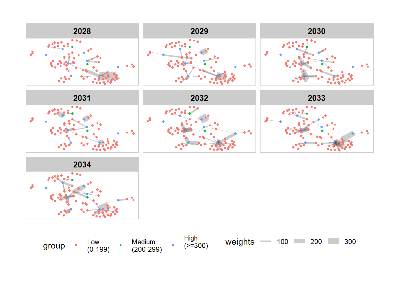
From the plot, it is observed that hai dan Corporation Wharf has received the most incoming links from Goa Seaside So Overseas as well as SeaSelect Foods Salt spray, as shown by the weights (thickness) of the edges between these nodes. For Mar Del Este CJS and Pao gan SE Seal, their biggest supplier are Danish Place Swordfish AB Shipping and Saltsea & Inc Carriers respectively.
# filter edges based on reduced nodes
edges_indegree2028  <- main_edges %>%
  filter(source %in% nodes_indegree$id | target %in% nodes_indegree$id) %>%
  filter(Year == 2028) %>%
  filter(weights > 50) %>%
  arrange(source, target)

#filter nodes based on filtered edge nodes for plotting
nodes_indegree_plot2028  <- main_nodes %>%
  filter(id %in% c(edges_indegree2028$source, edges_indegree2028$target)) %>%
  rename(group = deg_bin1)  %>%
  arrange(id)


#set as graph object using nodes and edges for in_degree centrality
staticgraph_indegree <- tbl_graph(nodes = nodes_indegree_plot2028,
                       edges = edges_indegree2028,
                       directed = TRUE)


#Plotting the graph
set_graph_style()

g <- ggraph(staticgraph_indegree,
            layout = "nicely") +
  geom_edge_link(aes(width=weights),
                 alpha=0.2) +
  scale_edge_width(range = c(0.1, 5)) +
  geom_node_point(aes(colour = group),
                  size = 2)

#putting as a facet presentation
g +
  geom_node_text(aes(label = id), size = 2, repel=TRUE) +
  ggtitle("In_degree Centrality Plot in Year 2028") +
  th_foreground(foreground = "grey80",
                border = TRUE) +
  theme(legend.position = 'bottom')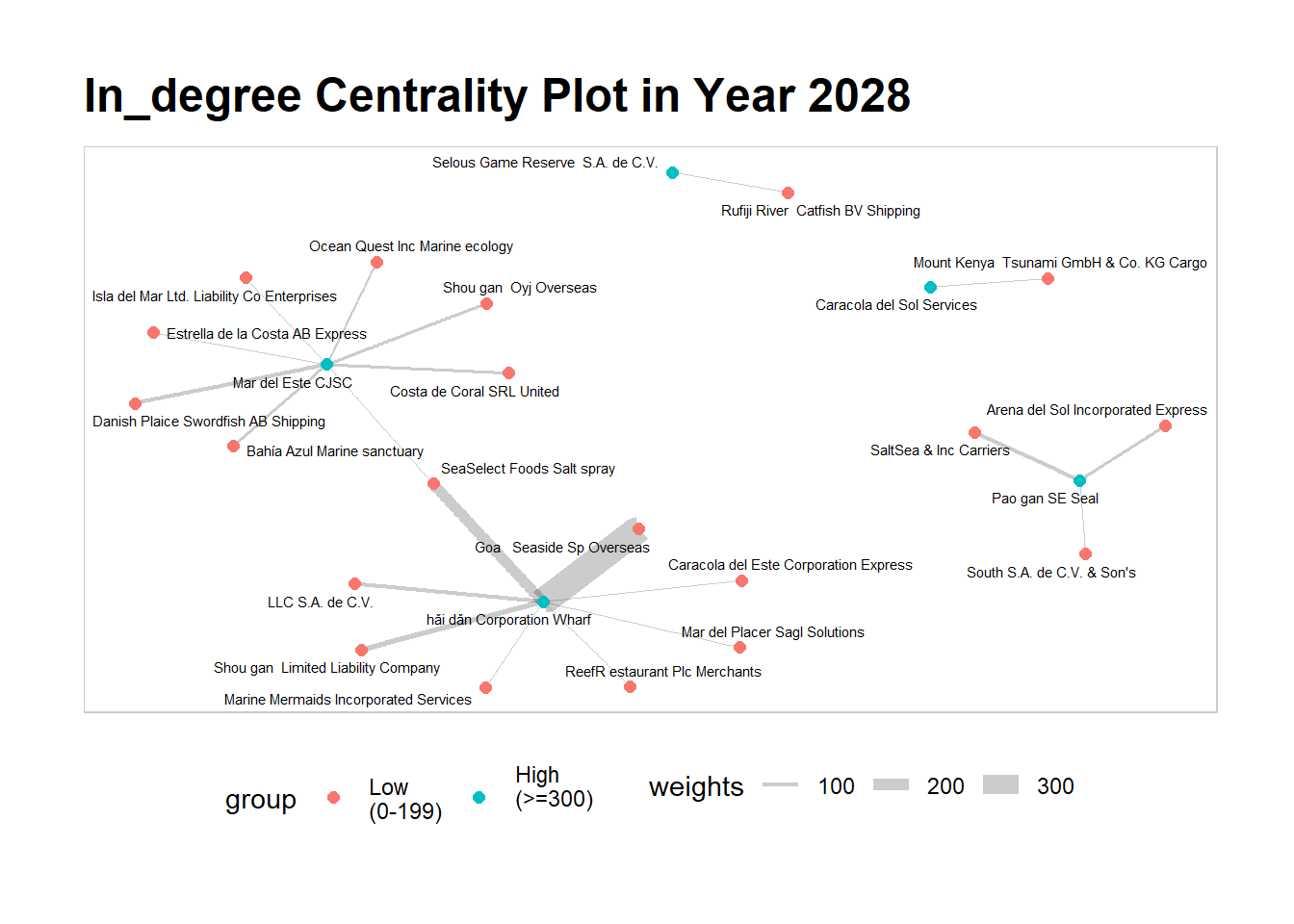
Moving forward to 2034, we can observe that the landscape has totally changed from 2028. LLC SA de CV, who used to supply to hai dan Corporation Wharf, is now their biggest supplier in 2034. Similarly, Mar Del Este CJS’s biggest supplier is now Estrella de la Costa who had also supplied them six years ago, abeit at a reduced weight (edges). Interestingly, we do not see Pao gan SE Seal, one of the nodes that is high in in_degree centrality score. By such comparisons between each year, we can chart the movement of the entities in FishEye’s knowledge graph and obtain deeper insights on their characteristics and behaviours.
# filter edges based on reduced nodes
edges_indegree2034  <- main_edges %>%
  filter(source %in% nodes_indegree$id | target %in% nodes_indegree$id) %>%
  filter(Year == 2034) %>%
  filter(weights > 80) %>%
  arrange(source, target)

#filter nodes based on filtered edge nodes for plotting
nodes_indegree_plot2034  <- main_nodes %>%
  filter(id %in% c(edges_indegree2034$source, edges_indegree2034$target)) %>%
  rename(group = deg_bin1)  %>%
  arrange(id)


#set as graph object using nodes and edges for in_degree centrality
staticgraph_indegree <- tbl_graph(nodes = nodes_indegree_plot2034,
                       edges = edges_indegree2034,
                       directed = TRUE)


#Plotting the graph
set_graph_style()

g <- ggraph(staticgraph_indegree,
            layout = "nicely") +
  geom_edge_link(aes(width=weights),
                 alpha=0.2) +
  scale_edge_width(range = c(0.1, 5)) +
  geom_node_point(aes(colour = group),
                  size = 2)

#putting as a facet presentation
g +
  geom_node_text(aes(label = id), size = 2, repel=TRUE) +
  ggtitle("In_degree Centrality Plot in Year 2034") +
  th_foreground(foreground = "grey80",
                border = TRUE) +
  theme(legend.position = 'bottom')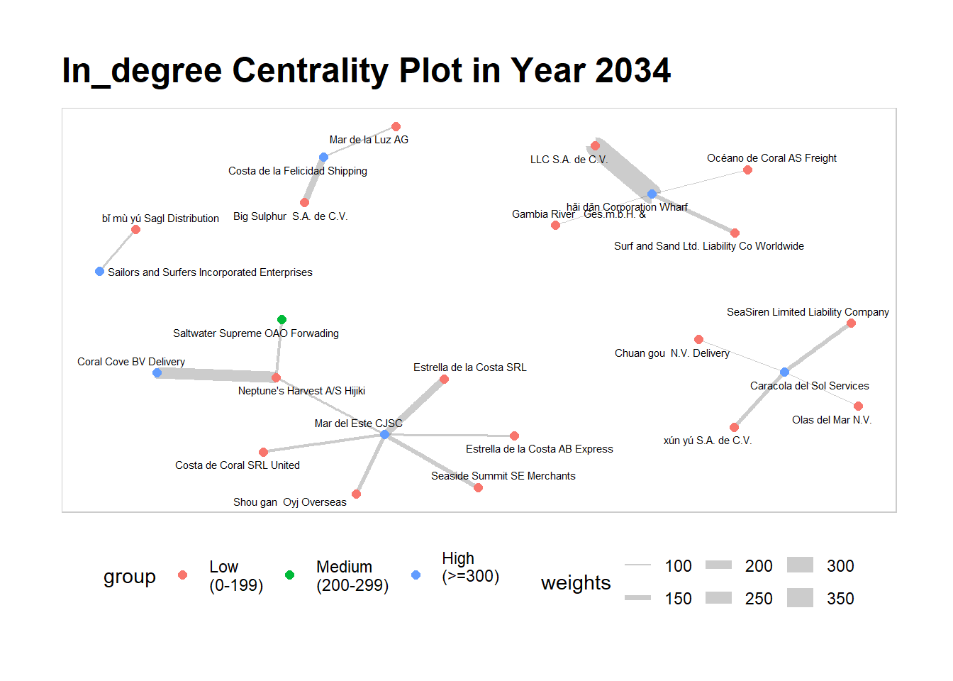
The visualisation and analysis of network data has helps us in understanding complex relationships and uncovering patterns within networks. It has enabled us to uncover valuable insights on central entities and influential nodes, and gain a deeper understanding of the complex network of business relationships of the entities within FishEye’s knowledge graph.